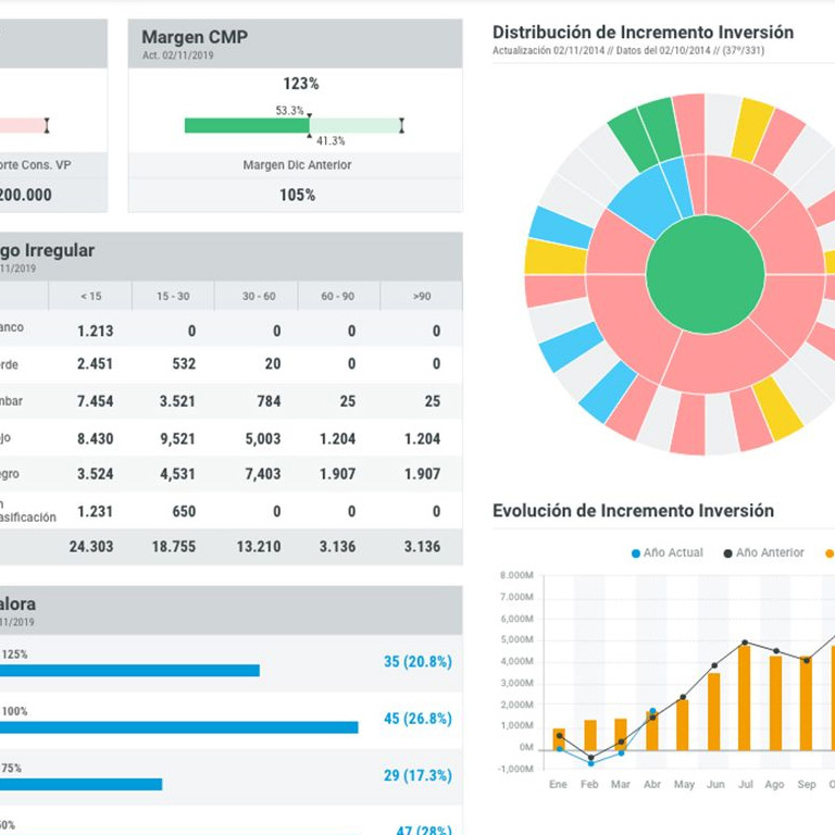
Data visualisation makes complex information easily understandable by presenting it in a visual format. This visual clarity aids in more effective communication of insights, enabling stakeholders to grasp key trends and patterns quickly.

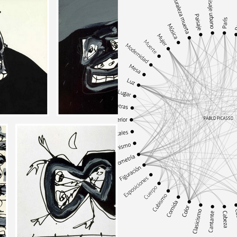
Data visualisation aids in extracting meaningful insights from complex data by presenting it in a visual format, allowing for a more intuitive understanding of patterns, trends, and correlations that might be obscured in raw data.

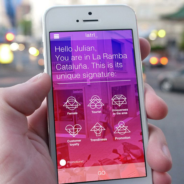
Data visualisation enhances the user experience in retail by presenting information in a visually intuitive manner, allowing customers to quickly and easily understand product features, comparisons, and reviews, ultimately facilitating more confident purchasing decisions.

WINNER
Best Digital Annual Review

WINNER
Technology, Innovation, and
e-commerce in Luxury

WINNER
Best Digital Annual Review

GOLD
Best use of digital to an investment audience

WINNER
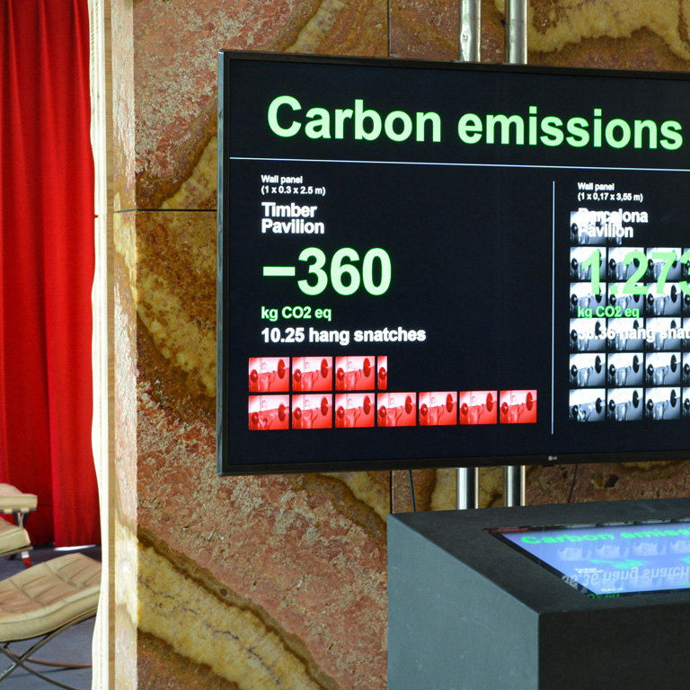
Green Category

WINNER
Innovation

Puig
CAF
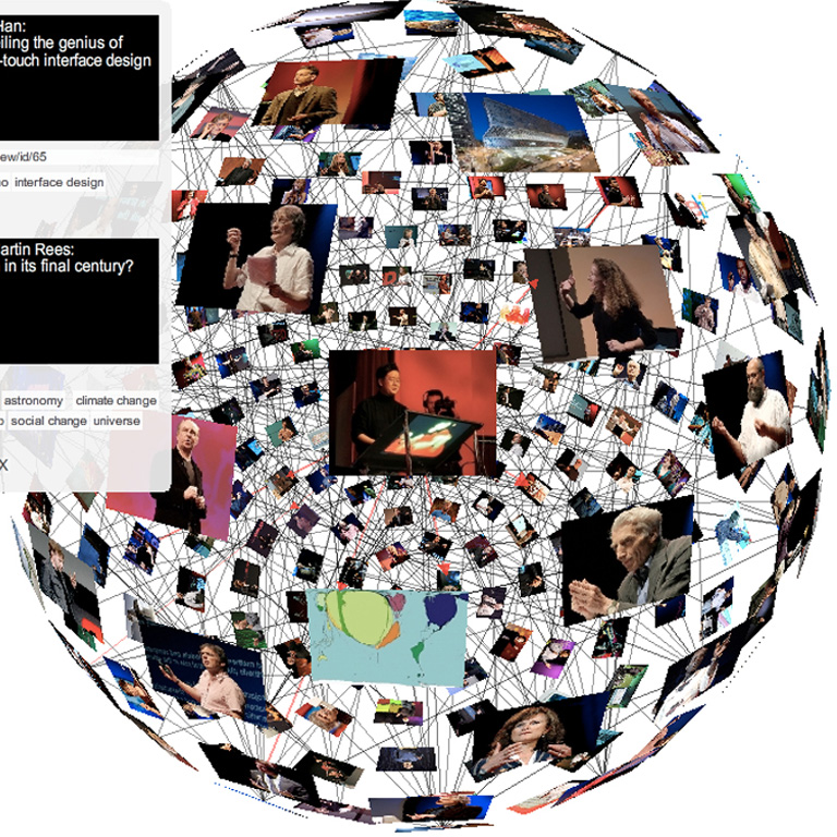
TED

The Alchemist Atelier
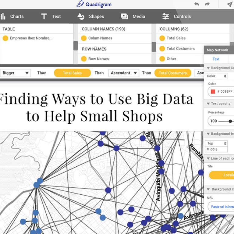
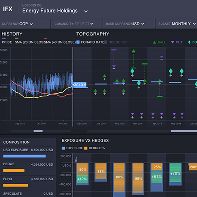
Quadrigram
Banc Sabadell
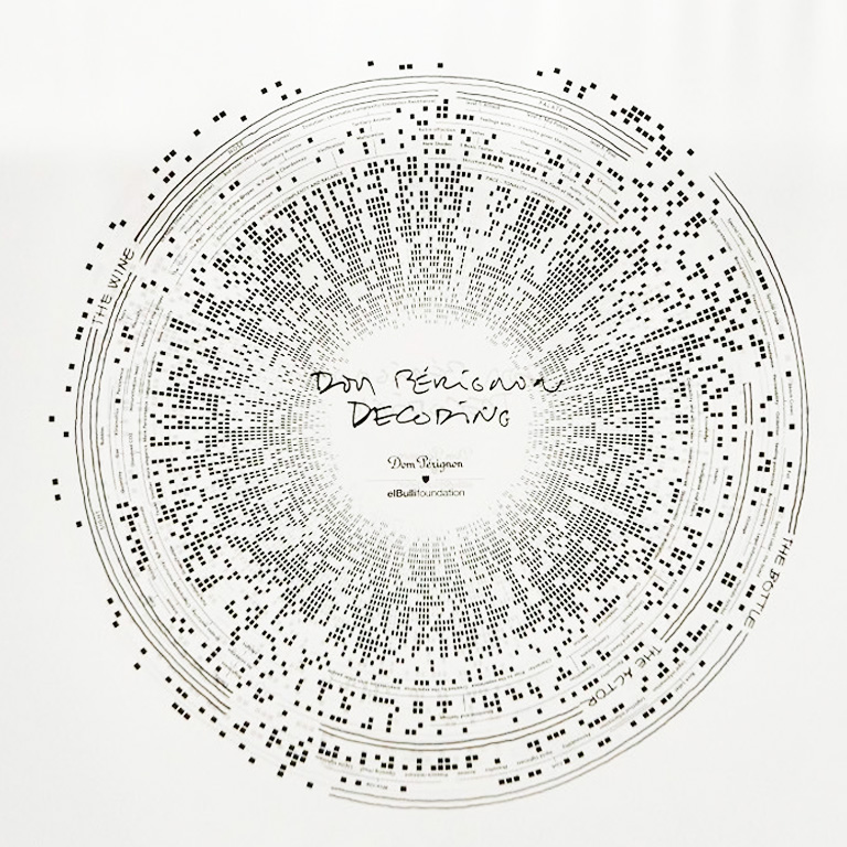
Dom Perignon
Desigual
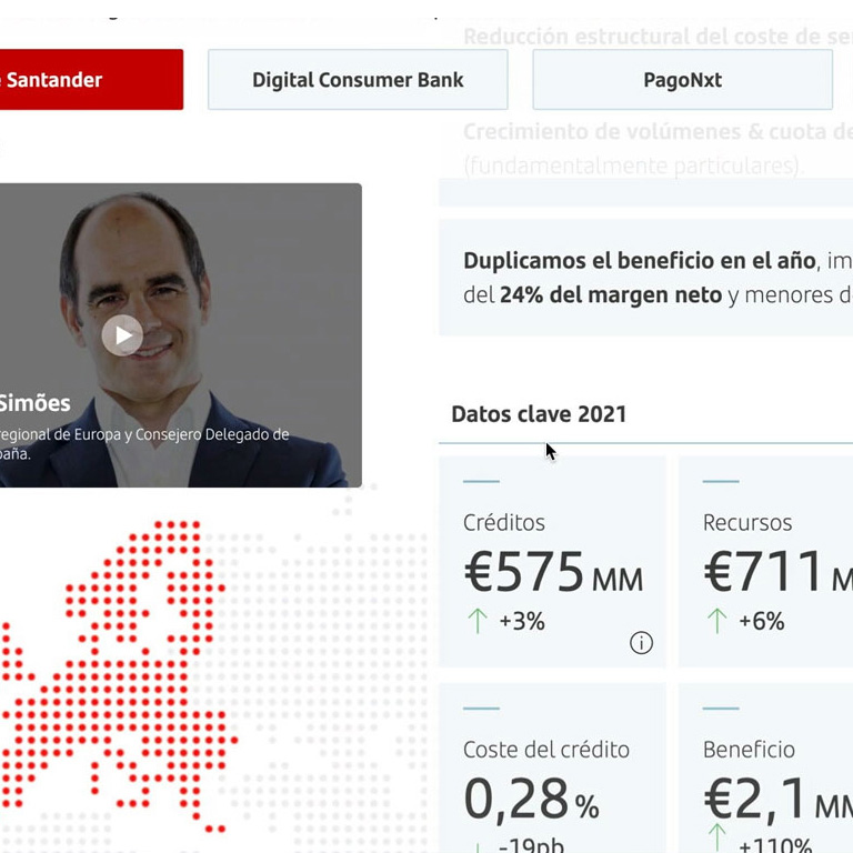
Banco Santander

Venice Biennale
Bauhaus Earth
BBVA
Telefónica
Banc Sabadell
FC Stone
Centre Pompidou
El País
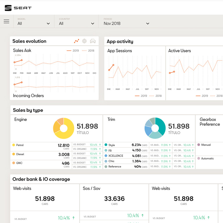
SEAT
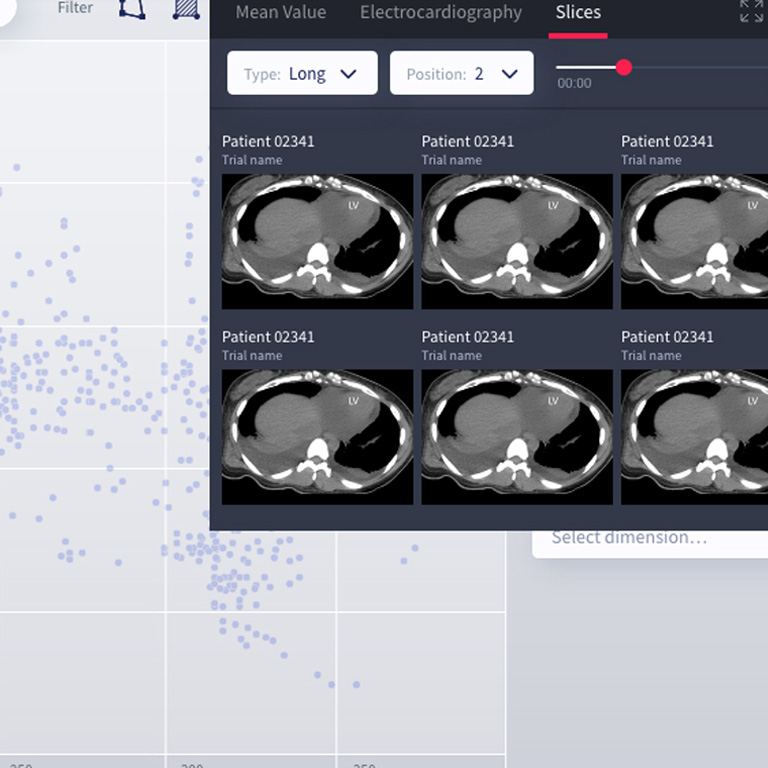
ELEM Biotech
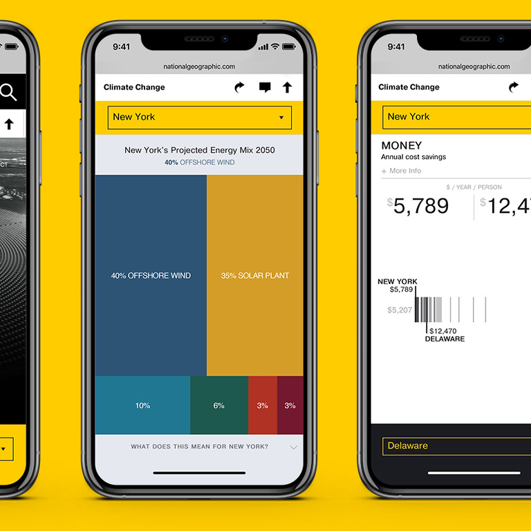
National Geographic
Delicious

Santa Mònica

Telefònica
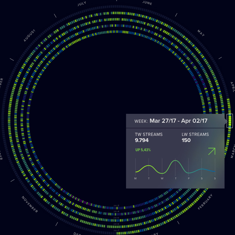
Warner Music
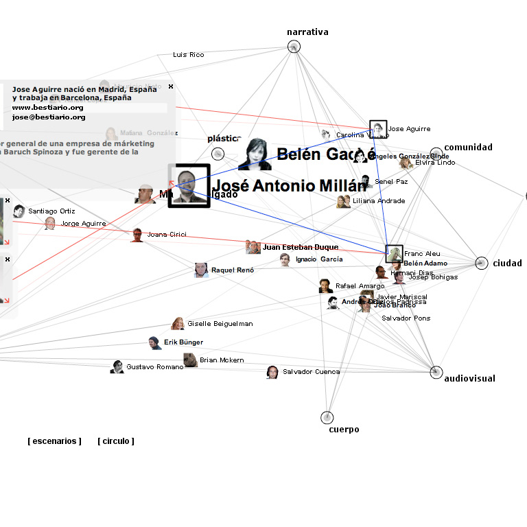
Bestiario
CCCB
SEAT
Satellogic